UX Propaganda: Psychological Techniques to Make Your Product Addictive
Propaganda is as powerful as heroin; it surreptitiously dissolves all capacity to think.
― Gil Courtemanche, A Sunday at the Pool in Kigali
By now, most people in the digital industry know how often products fail. On average, apps lose 77 percent of their users in the first three days.
[ctt template=”3″ link=”DEmwh” via=”yes” ]Did you know: On average, apps lose 77% of their users in the first 3 days. #Ethinos #Branding #UX #AppMarketing via @Ethinos[/ctt]
As an attempt to combat this high failure rate, designers refer to a tired checklist:
- Is your app user-friendly?
- Is performance optimized?
- Are the notifications useful?
- Is the market researched?
- Are actions rewarding?
But to designers’ dismay, we too frequently find ourselves 90 days later with just five percent of our users remaining. It might be time to take off the gloves.
While most propagandists and advertisers use these techniques to deceive the public, we’ll show you how to use them in design. In this article, we analyze the most effective techniques of propagandists and restructure their methods into a guide of design tips and tricks to retain users.
Appeal to Fear
Propagandists instill anxiety and panic in the public to build support for their cause.
For example, Joseph Goebbels exploited Theodore Kaufman’s Germany Must Perish! to claim that the Allies sought the extermination of the German people.
According to the Protection Motivation Theory, which is developed by the world’s top advertisers, people are motivated to protect themselves from physical, psychological, and social threats. When faced with a threat, people are directed to respond, depending on:
- The severity of the threat.
- The probability of the threat occurring if no adaptive behavior is performed.
- Availability of a solution.
- The individual’s ability to execute on the solution.
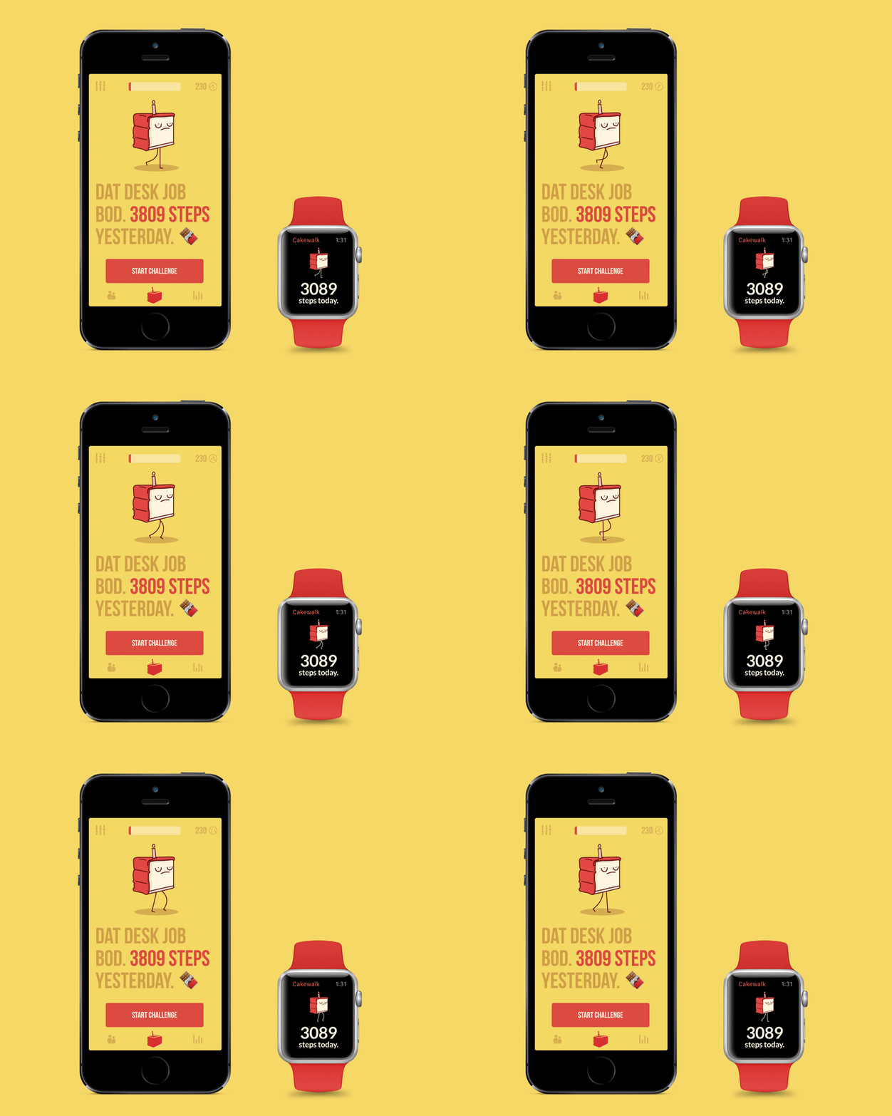
The health and fitness industry has employed fear to promote its products since forever. Take the cheeky step counter, Cakewalk, for instance. The app shames users as a form of fear to motivate people to stick to their exercise goals, and therefore keep using the app.
- Cakewalk indicates the severity of the threat when it suggests what kind of body you’ll earn with poor exercise.
- The app suggests the probability of the threat through consistent reminders about your daily performances.
- The user is then presented with a clear path of action as Cakewalk creates challenges specific to each user to meet in order to stop the shaming.
Appeal to Authority
This technique cites prominent figures to support a position, idea, argument, or course, action.
The Milgram experiments are an infamous set of psychological experiments that set out to test how willing people are to trust authority.
The experiment required volunteers to deliver what they thought were incredibly painful electric shocks to unknown patients. But, in actuality, no real patients were shocked.
When the volunteers administered a shock they heard faked screams. Despite the screams becoming increasingly worse, the volunteers were pressed to continue by a man in a lab coat.
Hopefully, the product you’re working on isn’t as sadistic as these experiments. But, what you can take away from this is the tendency for people to trust the authority of experts.
“All other things being equal, people buy from people they know, like, and trust.”
“Here’s How Uber’s Co-Founder Is Going to Take on Amazon and eBay”
– Bloomberg BusinessweekSY
The amount of products online today is overwhelming, which is why companies that curate the best products are becoming increasingly popular.
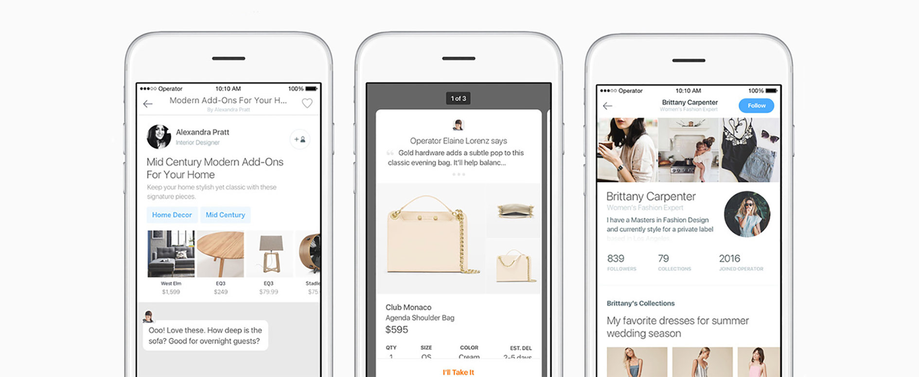
For example, Operator allows users to discover products and collections hand-curated by influential experts, including professional stylists, decorators, makeup artists, interior designers, and more.
Here are some other ways to appeal to authority:
- Offer a range of expert-created content, like how Herbalife provides health advice.
- Connect users directly to an expert, like the Apple support app does.
- Create content that proves you’re an expert, like HubSpot does.
Bandwagon
If all of your friends jumped off a cliff, would you?
When the bandwagon effect takes place the rate of uptake of beliefs, ideas, fads, and trends increases as they are adopted by others.
Facebook is a prime example of the Bandwagon effect, when it tells you “10 of your friends are using this app right now.”
Research shows that people are more than twice as likely to click a Facebook “like” button if they see that a few other people have already liked the page.
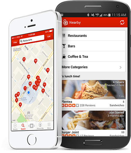
Yelp displays the amount of reviews in multiple places throughout the app to instill trust in its users.
Here are a few ways to induce the bandwagon effect:
- Display social media likes and shares in-app, or enable users to share content from your product.
- If you sell products in-app, provide statistics on how many others have purchased.
Beautiful People
The saying goes that “beauty is in the eye of the beholder,” but it actually isn’t.
Humans have a very specific definition of beauty, and they tend to give beautiful people or beautiful things the benefit of the doubt.
To put it simply, the beautiful people effect means that if something or someone looks good, we’re automatically inclined to believe that it is good.
Studies show that attractive people make more money—up to 14 percent more than average-looking people—and they tend to get more opportunities in general. This may be why the Kardashian clan is doing so well.
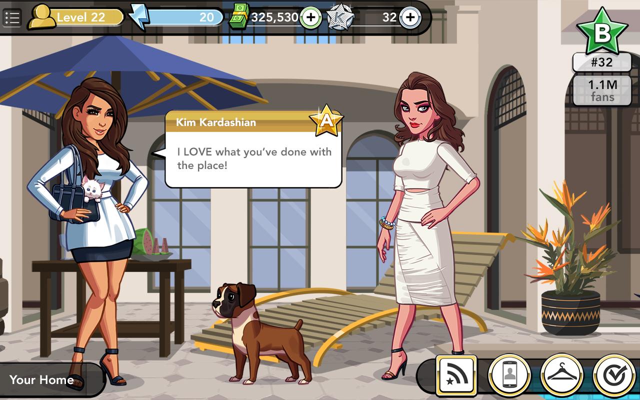
The game isn’t popular because the people playing it are stupid. It’s popular because they like it.
– Stuart Dredge
The choose your own adventure Kim Kardashian: Hollywood game has 28 million downloads and 11 billion minutes of play since it launched last summer.
Not only does Kardashian make people want to play her game, but she also gets users to buy products and tweet about it from within.
The game is about pretending you live a glamorous life, like the models you interact with in the game.
However, not every app has a beautiful endorser like Kim Kardashian to rely on, so how can you implement the beautiful people effect in your design?
You don’t necessarily need to include models in your products, but rather learn from the studies that prove people buy more things from attractive people, and apply this understanding to your product’s aesthetics.
People trust a good-looking app just like they trust a good-looking face.
Other than employing great visual design, you can:
- Put your prettiest products in the spotlight.
- Make sure that your product is showcased in an attractive way—not in just a useful or feature-filled way, but a physically beautiful way so that people are more inclined to trust your offerings.
Black-and-White Fallacy
You know how designers get frustrated when people suggest that we must choose between looks and usability? It’s because this is a false dilemma, otherwise known as the black and white fallacy.
A false dilemma involves a situation in which only limited alternatives are considered, when in fact, there is at least one additional option.
It isn’t nice to trick your users, but what you can do is simplify choices for them by limiting options. If a more complex process is necessary, then allow users to access a more advanced page.
A good example is how Uber handles its customer service.
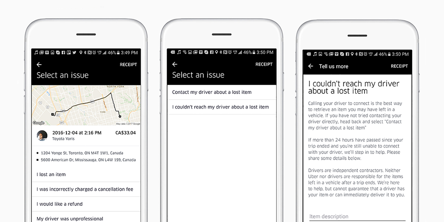
There is a great range of things that can go wrong on an Uber ride, but it would be a terrible user experience if Uber allowed you to select one of those many options from a list.
Instead, the choices are ranked by frequency, and a limited set of options is always presented until the user is filtered to their appropriate channel.
To employ a helpful false dilemma into your own products:
- Ask yourself what the two likeliest outcomes will be and address those.
- Use sidebars and other advisory tools to point users in the right direction.
Plain Folks Approach
This approach attempts to convince the audience that the propagandist’s positions reflect the common sense of the people.
It is designed to win the confidence of the audience by communicating in the manner and style of the target audience.
Propagandists use ordinary language and mannerisms (and clothe their message in face-to-face and audiovisual communications) in attempting to identify their point of view with that of the average person.
In traditional propaganda, this might manifest as a political figure running for office being shown in a backyard or shop doing daily routine things. This image appeals to the common person.
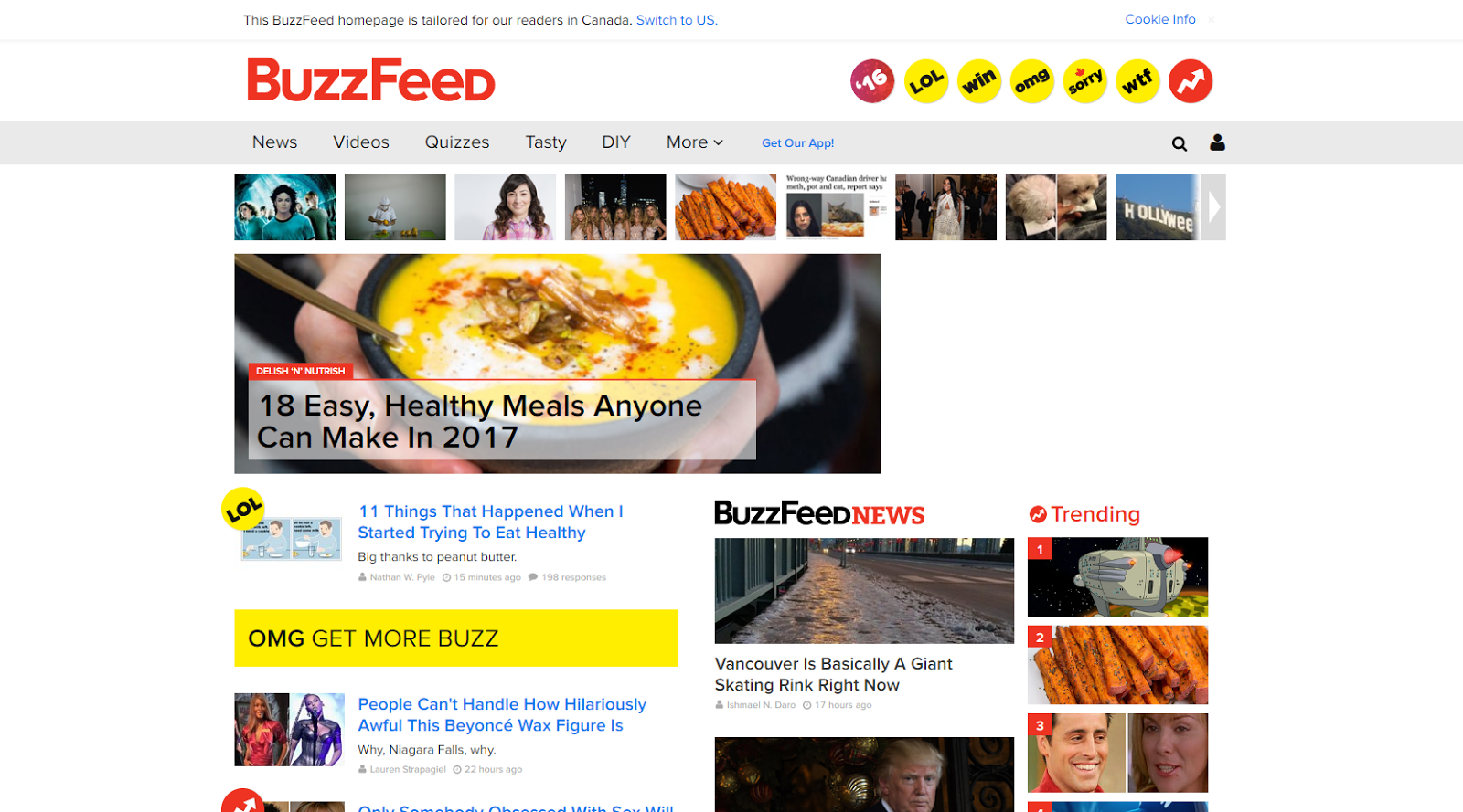
A literal manifestation of this as both propaganda and design is in Pantsuit: The Hillary Clinton UI pattern library.

Pantsuit’s aesthetic, layout, and content types all draw from a Buzzfeed-esque style. Thus, the product feels familiar and communicates the Clinton campaign’s hopeful message that Hillary would be the common person’s President. In this case, the design more specifically targets the common young person, as they are more likely to be using the platform.
However, keep in mind that every user demographic is different, therefore their idea of the common person is different.
Loaded Language
Language framing propaganda constructs social opinions through mass media, political movements, political leaders, or other actors and organizations.
Propagandists use loaded language to influence the individual’s perception of who or what the propagandist represents.
The method uses words and phrases that speak more to the emotions of the audience, rather than their rational.

Airbnb markets its Experiences as if they were the next lineup of Netflix productions. For example, right now a DJ is offering a workshop and clubbing experience, called “Life Changing Music.”
Will this experience substantially change your life? Probably not. But are you more inclined to join? Yes.
Although using loaded language appears simple, it can be difficult to effectively pull off. Here are some tips:
- A/B test your copywriting.
- Steer away from words that insinuate uncertainty, like try, might, maybe, perhaps, etc.
- If your goal is to create a need based on fear, be careful that your language does not trigger feelings of dishonesty or distrust.
- Use words suggesting your customers will save money.
Repetition
This is the repeating of a certain symbol or slogan so that the audience remembers it.
In cinematic propaganda, it was often in the form of a jingle or an image placed on nearly everything in a scene. This also includes using subliminal phrases, images, or other content in a piece of propaganda.
Repetition is a classic design technique.
The repetition of design elements in a design brings a sense of clear unity, consistency, and cohesiveness. When menu options and design elements repeat, users navigate comfortably.
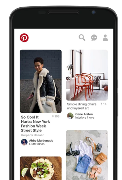
Some say Pinterest is responsible for the popularization of cards, which is now a widespread practice.
The layout is a simple repetition of similarly formatted cards that endlessly scroll. The format makes the app easy for users to lose track of time flipping through images.
Slogans
Slogans condense ideas into short, easily remembered phrases, and they don’t provide any factual information. They’re a propaganda tool because they try to convince people to do something they may not necessarily do on their own.
A political slogan is a memorable phrase, which is often used in political speeches, marketing, and advertising. It expresses a key idea in a political campaign. The purpose is to have something noticed, and put into the minds of people.
Most apps or digital products don’t have socio-political agendas outside of the desire to push their own brand. Thus, a slogan can be an effective way to strengthen the connection with users to a brand.
Many brands dream of their product becoming a household phrase. The most obvious being when we tell someone to “Google it.” And more recently, Tinder has introduced their slogan to “swipe right” into our vocabulary, as it’s even often used in reference to things outside of the app.
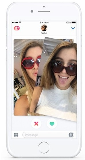
Tinder’s trademark slogan/gesture is so popular that several other apps are mirroring its design. “Swipe right” to adopt a puppy, buy shoes, or even find a job.
Some might suggest that to adopt the swipe gesture is not to accept the Tinder propaganda, but you will find that each of these apps refer to itself as the “Tinder of” job hunting or shoe shopping.
Instagram’s direct messaging is an example of a solid product that has failed to stick without a slogan. The direct message product is notoriously “unverbable.”
Here are a few tips to improve or develop your slogan:
- Ask yourself: Can my product name be used as a verb?
- Avoid culturally specific idioms.
- Keep it short. Slogans are often just four words or even less.
Third-party Technique
The third-party technique suggests that people are more willing to accept an argument from a seemingly independent source of information than from someone with a stake in the outcome. It’s a marketing strategy commonly employed by PR firms.
The third-party technique can take many forms, ranging from the hiring of journalists to report the organization in a favorable light to using scientists within the organization to present their perhaps prejudicial findings to the public.
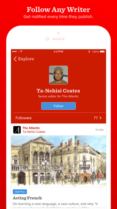
The app Longform provides an alternative platform for users to read their favorite editorials.
Rather than sifting through all of the content of a single paper, readers can only follow their favorite third-party writers. In a world where the news is becoming increasingly untrustworthy, third-party individuals hold a lot more clout.
Having direct access to content from influencers is a common trend in many platforms today. Think about Medium’s success and the esteem of a verified Twitter account.
Make your product sticky.
In a time when meeting basic usability requirements is a given, and competing products are reaching feature parity fairly quickly, what differentiates digital products anymore?
Often the products that you are building have several competitors in the same market, so how will your’s stand out?
Employ these propaganda techniques, and make your product the one that sticks with many more than five percent of your users.
Why do people choose Gmail over Yahoo, Medium over Blogger — if the products are 99 percent the same? It’s not that they disrupt usability standards. It’s the additional layer of sophistication that is only achieved when you put enough time and brainpower into making a sticky product.
what do you think?