New Trends In Logos That Will Boost Your Brand : World of Logomania
If the brand represents the overall personality of the company, then the company’s face is the logo. You can’t control and decide how people will see you, but you can control what it is that they see. And this fact is what makes logo design an immensely important aspect of brand management.
It is one of the most impactful and influential marketing element that a brand can have. As a matter of fact, it’s already existing for centuries, dating back to the age of Pharaohs who give symbols and names to their gods.
What Makes A Good Logo?
A good logo should epitomize your brand and make it easy to recognize. Take your cue from Nike. When you hear the brand itself, you can imagine the logo right away. It exists everywhere, from business cards to your books and all the way to your website.
And because a logo is the key part of your brand, it’s important that it stands out above the rest. When you think about it, logos are just the same with coffee, fashion, and websites. They all have standard versions, but trends reshape them to stand out more.
To help you achieve that state, below is the following trends for the logo in 2017 that’ll make a difference in the reputation of your brand. So take heed and let the logomania begin!
Simplicity
Source: https://c1.staticflickr.com/8/7504/15693409827_fa6b34a145_b.jpg
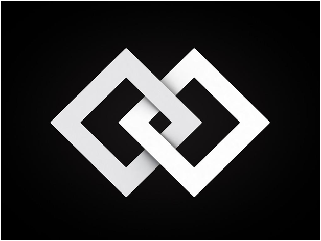
This trend is the fitting adjective for the phrase ‘less is more.’ Simplification is the big sister of all trends which focuses on tightening up and streamlining design elements. Intricate and complex items have clear the way for straightforward and sleek yet creative artwork. And the best part about simplified logo designs? It fits all types of businesses!
The growth of mobile users is a good enough reason to start streamlining logo designs. There’s a rapid increase of Internet visitors who use mobile devices when browsing online. And small screens mean small design items. You should keep this factor in mind when it comes to creating your logo.
Shapes and Geometric Lines

Source: https://pixabay.com/p-1616195/?no_redirect
When you speak about simplicity, clean lines fits the description very well. It is a bright idea to use geometric shapes and lines of symmetry to create unique and distinct logo formations for a logo.
This idea is a creative solution to regenerate old but established brands, putting them back to the marketing spotlight where they belong.
Positive and Negative Space

Utilizing black and white or a combination of solid colors and white is an optical illusion that materializes from using negative and positive space. The front part of any logo is designed to make a supplementary image inside the background.
When the elements of the logo create multi-dimensional appeal, these logos will imbibe a deeper message or give out more information about the brand such as location and age.
The Art of Letter Stacking
Source: http://justcreative.com/wp-content/uploads/2015/06/letterstacking-logos.jpg
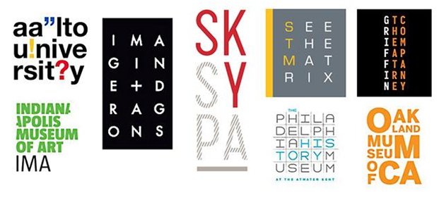
Letter stacking is a unique way to create a more visual brand logo. Rather than writing out your business’ name, spice up your logo by using this method.
The font becomes the logo itself when using letter stacking. Due to the nature of the logo, you need to pay more attention to details than usual to make the letters more readable and visible. A unique layout is a surefire to create a lasting impression on the people who see it, and this is the beauty of this trend.
The Power of Cropping

This trend is another epitome of the phrase that ‘less of more.’ Cropping is a traditional technique that pushes the envelope by showing little information while conveying a strong message at the same time.The method of this trend is to conceal certain elements of the letters but leaving just enough detail that is still readable.
Free Hand Is Making A Comeback
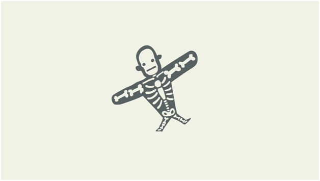
Remember that comforting sense of nostalgia when you discover a box of presents in your room? It’s the same personal feeling that you can transmit to your brand by creating a hand-drawn logo.Hand-drawn designs spring from different senses such as fresh, playfulness, casual and grounded and just about anything restricted by typed letters. Be warned though, make sure the logo remains readable and legible, avoid the family doctor syndrome when it comes to penmanship.
Vintage

Since we’re talking about comebacks here, vintage logos indeed deserve a spot on the list. This trend is using a combination of design elements such as white, black and gold writing. It also uses geometric shapes, lines, and images.Vintage designs in logos provide a sense of trustworthy and established business for your brand.
However, you need to be careful. There’s a fine line between looking just plain old and hipstery, so find the right balance between the two. The last thing that you want to happen for your brand is to look like it’s stuck in the past.
Black and White

This trend is all about using black and white colors. These colors exude a sense of class. What’s more, it fits any design and color schemes, and it fits anywhere.
For a real ‘wow’ factor, incorporate black and white trend with negative space. These colors also add variation to any colored logo. Its concept is the same when you print business cards, the focal point is the letters on the card.
Ombre
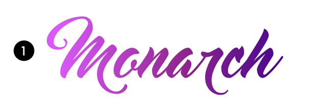
Does it work? Yes, It does because it’s intriguing to the eyes! This playful trend is ideal for any artistic based business such as photography, beauty blogging or fashion styling. This trend is usually common among quality but cheap business cards.
World of GIFs (Graphics Interchange Format)

This trend has a similar concept to cinema graph which uses moving parts with eye-candy visuals.
Takeaway
Creating the best logo makes a big difference in building your brand in a memorable and positive light, as well as building customer loyalty. Do not settle for anything less. Be creative, keep things simple and make sure that your logo reflects the value of your business and the personality of your brand.
Maria Estrada is a business associate of Print Meister, a printing company based in Australia. It is one of the rising stars when it comes to Print Advertising in Australia. She loves writing about topics related to cheap business cards, designs, logos, and branding. You may connect with Maria on Linkedin.
Hi maria,
Nice Blog. This was very impressive logo in blogs. This blog gives new ideas for creating logos.
Logos define a brand or a company and Maria you’ve written a very informative blog on the importance of logos. Thanks for sharing!