The buzz that’s WEB2.0

Remember those animated gif images with opening and closing doors or the bright blinking buttons? What about repeated thumbnail backgrounds and multi-colored fonts on a single page to give your pages a ‘design’ dimension?!
Well, thankfully, it’s been a while since we’ve seen stuff like that on the web! Websites have surely come a long, long way from text heavy and gaudy designs in the early 90s to where they stand now, with the Web 2.0 look!
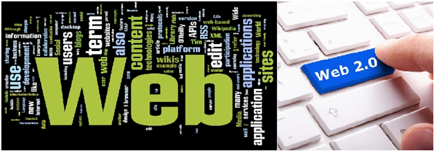
While some clients understand what the Web2.0 look is, some others simply know of Web 2.0 as a buzz word and want it implemented in website designs. The fact is that there is no such thing as a Web2.0 Standards. It is merely a set of good practices while building a website, to enable user friendly designs that look good and make sense!
So having looked around, here’s my observation and list of what web2.0 websites look like:
- Simple, clean, and clutter free designs
- Bold, eye-catching, and separate header sections that communicate immediately to the user
- Subtle, pastel backgrounds
- Bright and bold colored, large images that stand out
- Each image tells a story, or else it goes into the background
- Large fonts no longer constrained by the Web safe font families, with @font-face css styles
- Content is inviting and sensible, crisp and concise!
- Simple, clear and intuitive navigations, enabling users to find what they need easily and quickly. Users don’t click any more than 3 times to get to any given information they need!
- Strong call to action button, that immediately catches the eye on any web-page
- Shiny buttons, subtle gradients, and reflections
- Cute icons with clear section headers
Like, I said, I’ve put together the above list with my observations of what some really great web2.0 websites look like. But, look closely at a good website and you’ll realize that elements above need not all be used together! It’s about being pragmatic and thinking as a final user, rather than as a designer trying to use every canvas as a portfolio!
All web 2.0 websites however, follow these 3 simple rules:
- Simple, bold, elegant designs; where less is more
- Less ‘Flash’ (pun intended) and more compatible websites
- User AND Search Engine friendly websites
My take is, that while HTML-5 is at the verge of revolutionizing the web completely, Web 2.0 looks like it’s here to stay, cause simply put, it’s just design that makes sense! What do you think?
Abhishek is a part of the Ethinos search team and helps client with various search techniques.


It’s a nicely put together concept and shall be appreciated for that. Thank you for explaining what necessary to be said.